
Aussie Home Loans
How I increased broker and customer satisfaction by optimising a simple tool.

Role
Senior Product Designer
Date
2022-24
Product Designer
Business analyst
Product manager
Tech Lead
Developers
Team
Skills
Product Design
UI Design
Overview
The Context
Aussie is a leading Australian home loan specialist. Lendi is Australia’s #1 online home loan platform.
During the merger between Lendi and Aussie, it became evident that there were big differences in the two brands’ approaches.
Aussie is traditionally relational whereas Lendi has a more transactional approach.
Brokers usually have around 45 minutes with a new customer.
Most of these are face to face, the others over the phone.
The aim of these conversations is two-fold – for the broker, it’s a chance to understand the customer’s needs and goals, build rapport and to convert them to a customer on the platform. For the customer, it’s a chance to build a relationship with the broker, and to takeaway their current lending position as well as any suggested steps in order to achieve their property goal. It’s very much a two way street.
This current process was causing a number of problems for multiple users;
The merging of the two brands onto one platform highlighted some key issues for our users.
This was particularly evident during the initial conversation phase (acquisition) between Aussie brokers and their customers.
During these conversations with customers, brokers usually calculate borrowing capacity, the funding position, as well as any savings that could be made upon existing lending.
The platform provides brokers with tools for this acquisition phase - Savings calculator/Borrowing Power calculator and Funding Position Calculator. However, these tools require a customer to be added, as well as user authentication, totalling approx. 15-30 minutes out of a 45 minute appointment.
Due to this, brokers were favouring third party tools for ease and speed.
The Current Process
The Problems
Brokers feeling as though they are perceived as incompetent in front of customers due to clunky platform tools.
Customers not getting what they need from the initial conversation with brokers and looking elsewhere.
Users
Business
The platform was getting put aside with comprehensive external tools being favoured.
Customer acquisition has lowered since the merger
Customer retention decreased
Brokers losing faith in the platform
The Affect
I collaboratively gathered insights from broker and customer interviews, event tracking on platform tools, and sentiment surveys.
To identify the why, and the reasons for these issues
To increase user satisfaction
To reduce external tools being used
The Goals
The Process
User Research – Field Study
Myself and 5 designers from other cross-functional teams were assigned high performing Aussie retail stores to spend 3 days observing, understanding and interviewing as part of ethnographic research.
The aim of the field study was to go to the source, observe the problems, and understand first hand with empathy.
During the one hour interviews, we asked each broker a range of questions to surface frustrations, pain points, suggested solutions and underlying needs in relation to customer conversations.
It was important for me to capture emotions and empathy resulting from both positive and negative experiences within the platform in order to understand how we can improve the issues highlighted.
Broker Interviews
I was able to observe a few initial conversations between broker and customer. These provided me the opportunity to understand which tools are being used at this interaction stage, and the sentiment of the customer during the conversation.
Observations
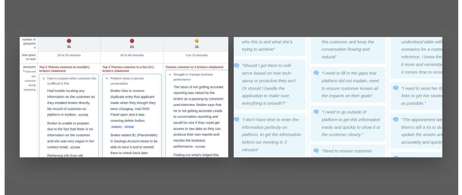
Multiple lending scenarios explored throughout the meeting/call
Observations
Used external calculators that provided more in-depth exploration
A lot of the time was spent building rapport - getting a vision of their customer’s overall situation.
Customers were seeking figures to take away with them
A broker’s main goal is to establish credibility and trust. They do this through building rapport, understanding customers’ needs and sharing their expertise by offering tailored options - they must show more value than purely where to find the cheapest finance deal.
Broker Initial Customer Interaction Goals
Educate customers every step of the way so they have no doubts, including explaining the benefits of having a broker vs dealing with banks directly.
Secondary Goals
Being able to quickly give the customer the green light on what they wanted or provide suitable alternatives.
How can the platform and supporting processes evolve to better support face to face conversations, higher volume of repeat business and client interactions?
Exploration & Validation
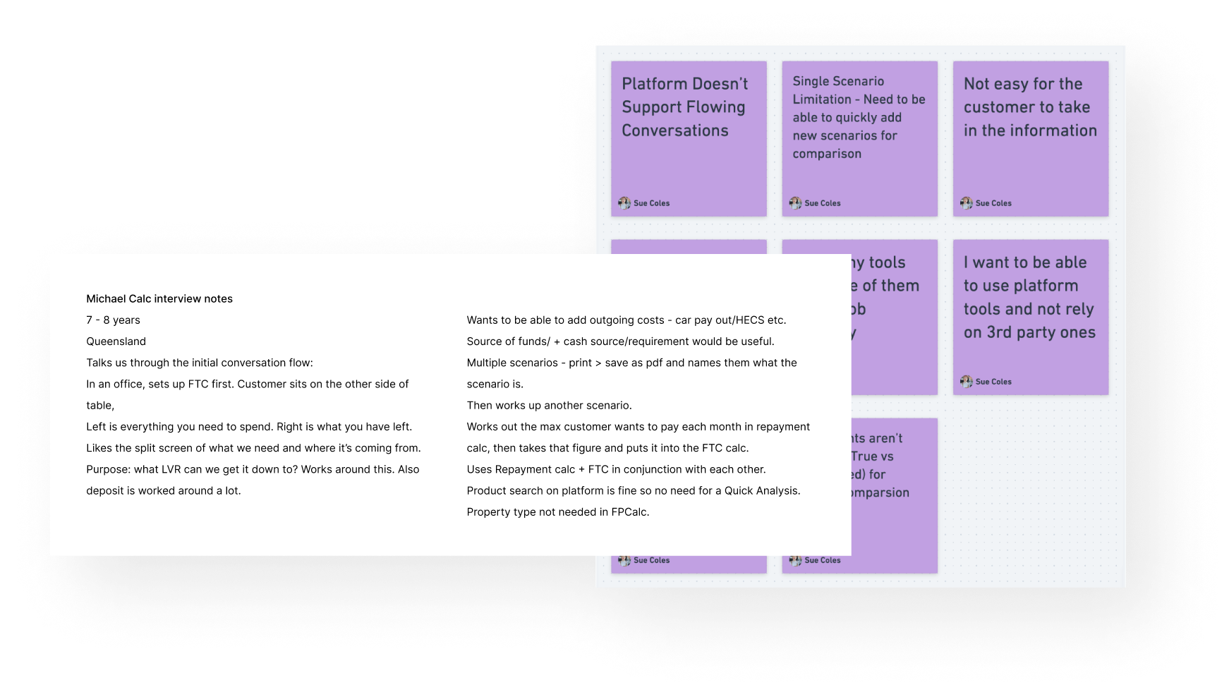
At this point, we all returned to our respective teams, armed with a wealth of insights.
I ran a workshop with my team (quad + engineers) to relay the underlying pain points and issues so that they could empathise with the users and gain perspective.
In order to improve the customer experience and really question and understand the why, we needed to identify the areas of platform where my cross-functional team held influence. We set up 4 user focus sessions online with brokers to explore this further.
I introduced continuous discovery to my team, and as a part of this, the Opportunity Solution Tree framework. We had been very technically focused and at times had sometimes lost sight of the problems we were solving.
Opportunity Solution Tree
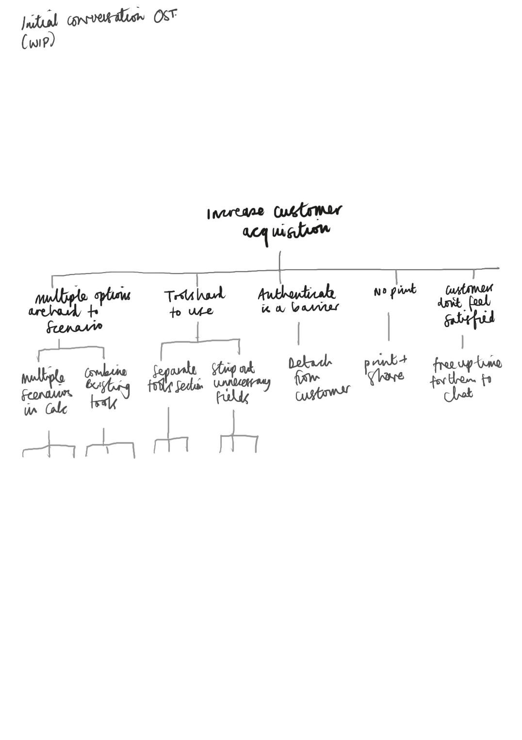
I lead workshops both within my team and cross-functionally to;
1. Define the business outcome
2. Map opportunities to the tree based on insights identified during the field study work
3. Ideation of solutions for each opportunity
The OST was great for providing endless potential solutions whilst linking back to the business outcome.
The opportunity that we assumed provided most value to the customer, and aligned with the business was turned into a solution:
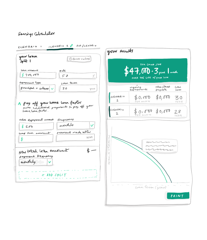
To optimise the current repayments calculator on platform in order to better support initial conversations.
In order to improve user experience, the calculator must:

Support multiple refinance and purchase scenarios in order to give customers options and reflect broker expertise.
Be easily accessible (not attached to a customer or application).
Allow the broker to compare up to 3 scenarios.
Have a downloadable version to send to customers.
Easy to use.
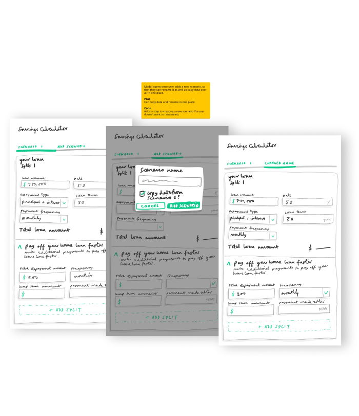
Ideation & Rapid Prototyping
To speed up the initial design process, I sketch wireframes and turn them into clickable prototypes.
Around 7 initial ideas were sketched into wireframes to test the various structures and functionality.
These were shared with stakeholders and some of our focus group brokers.
Once we had shortlisted the solutions down to two, I turned them into prototypes to test them more comprehensively…
User Testing
User testing involved screen recorded demos,
1:1 usability testing with scripting and broker drop-in sessions.
Regular designer sync sessions ensured the consistency of design components and patterns from a UI perspective.
Stakeholder engagement occurred weekly to highlight the solutions and align the link to the outcomes and business vision.
Results of testing:
Didn’t think there was need for the coloured summary box in the results section as all of that data is easily shown in table below.
Print view needed the graph shown as well as the table
Wanted the option to change payment frequency as many customers like to compare scenarios
Loved the copy, edit and delete scenario options
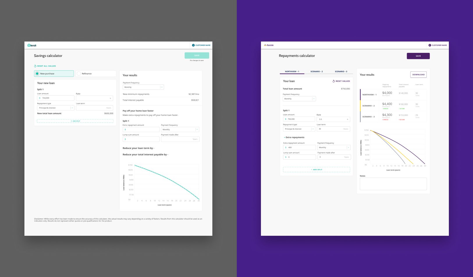
A standalone tool to capture key data required for workshopping loan scenarios for customers.
The Outcome
During initial conversations, brokers had to capture and input lengthy and time consuming information from the customer onto the broker platform before being able to workshop any lending scenarios. This also required customer authentication. The process would take between 15-30 minutes.
Previous User Process
Functionality to support multiple scenarios in order to give customers options and reflect broker expertise
Be easily accessible (not attached to a customer or application) so that brokers can be responsive
Allow the broker to compare up to 3 scenarios to cover a variety of options for the customer
Easy to use to improve perception of broker competency
A downloadable version to send to customers so that the customer leaves with something of value
What We Implemented
UX/UI Specification
Objectives
User Journeys
Research findings and data
Decision logs
Links to designs + discovery boards
Specific component/implementation details
Documentation
The Results
Whilst we don’t have quantitative metrics to measure customer retention, we decided during discovery that if we were to improve user satisfaction, it was important to regularly measure sentiment.
Sentiment surveys were issued to both brokers and customers, as well as a small group of user interviews and focus groups to gain some deeper understanding.
Key highlights
82% customers were satisfied with the information they took away after their initial conversation with their broker.
92% of brokers felt more confident in providing value when in front of customers.
79% customers were happy with the service provided by their broker.
69% of brokers have ditched the external calcs that they once relied upon in favour of platform.
75% of customers who were seeking multiple broker opinions decided to choose Aussie.
User Impact
By optimising our current tools into one, the impact on our users was multiple and spanned across the group;
Customer acquisition increased
Broker journey remained within platform
Customer-broker sentiment increased
Customer referrals increased
Quality of initial appointment time improved
By optimising a simple calculator, we hit our goals of increasing user satisfaction and reducing external tools being used in place of platform.
We also stayed true to the brand values - Customer first approach / Stonger United.
As part of continuous discovery, there will be regular user interactions in order to further optimise and detect further areas that can be improved.
Learnings
It’s not always the big feature products that are most impactful or meaningful - sometimes a tweak in optimisation makes a big difference.
There’s no one shoe fits all solution in the product space. Understanding differing user types and requirements means that optimisation and tailoring is sometimes needed.